Dresun
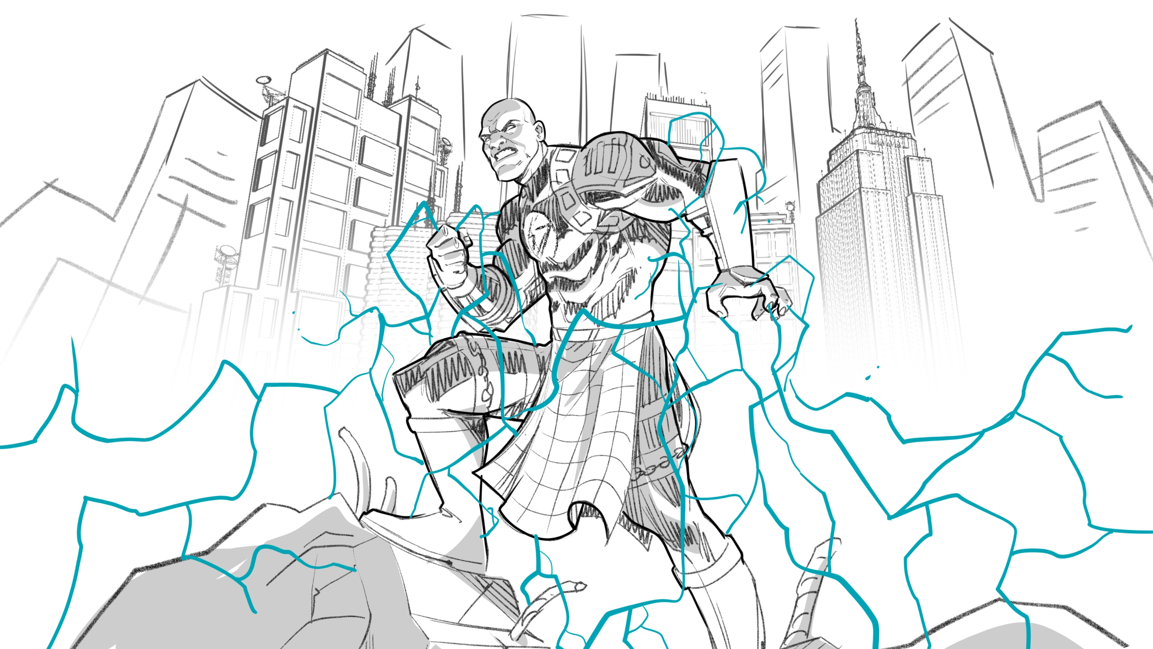
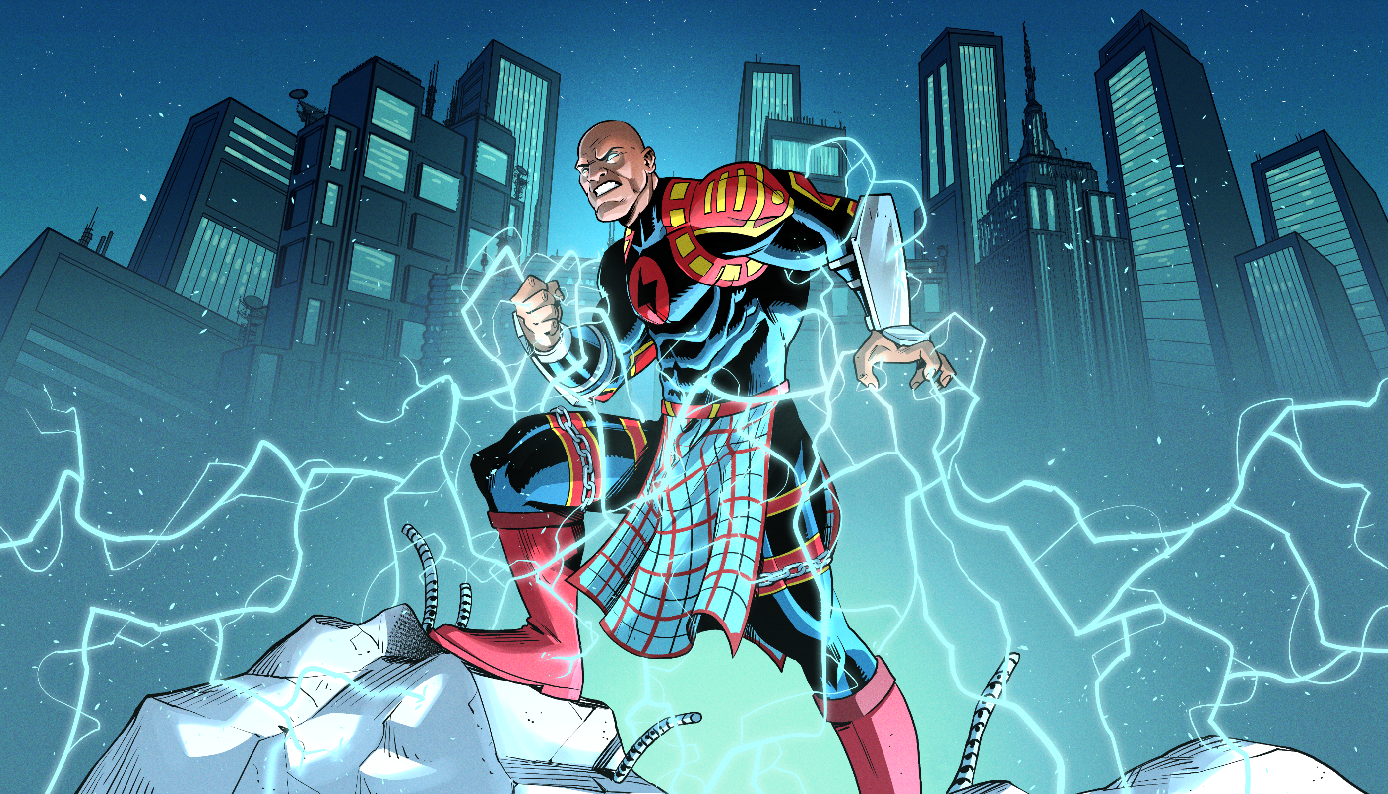
Dresun, a captivating new comic series, is in the process of expanding its universe into the film industry. To support this growth, Dresun needed a complete rebranding and a digital platform that would enhance its presence and capture the imagination of a diverse audience. The project involved a multi-faceted approach, focusing on website design, visual storytelling, and brand refinement, all with the goal of aligning the comic’s identity with its upcoming film adaptation.


Hero Red is a vibrant shade that embodies courage and strength, symbolizing the heart of a true hero. It’s the primary color that captures attention and inspires action, perfect for logos and key branding elements. The fiery and dynamic Flame Red adds energy and passion to the brand. It represents the fierce determination and unwavering spirit of Dresun. Rising Yellow brings a sense of optimism and hope. Regal Blue is a deep and majestic blue that conveys trust, wisdom and loyalty. A powerful and versatile color, Midnight Black represents mystery and strength. It adds depth and sophistication to the palette, perfect for typography and creating contrast in designs.
Together, these colors create a bold and inspiring visual identity that resonates with the heroic spirit and values of the brand.
Yellow
Blue
The new logo provided a modern and striking identity, while brand guidelines were established to ensure consistent application across all platforms. Custom visual elements, including professional illustrations, were integrated throughout the site to reflect the unique world of Dresun, bringing the comic series to life in an immersive, digital experience.


