
Marketplace App Development for Quote This Project,
a Local Home Services App
How EspioLabs Helped Bring Quote This Project's App from Product Concept to Production
Client Snapshot
Engagement Scope
- Mobile app design and development for the QTP marketplace experience
- Website design and development for QTPAPP.COM
- Product flow planning for homeowners and QTP Home Helpers
- Rosie AI assistant and brand character creation
- Character illustration, pose development, and animation-ready asset direction
- Launch marketing support across social media, app positioning, campaign messaging, and promotional content
Challenge
QTP had to introduce a new kind of local marketplace in a way that felt straightforward, useful, and easy to understand. The platform needed to cater to two different user groups: homeowners needing help with everyday household chores and local helpers looking for flexible project work.
The challenge was to make the app feel approachable without creating confusion around what the service offers. QTP can help with common handyman-type tasks, but it's not an app to locate licensed professional contractors. It links users with local helpers, but homeowners are still expected to do their own checks before hiring anyone.
EspioLabs had to design the product, visual direction, website, and launch messaging around that difference. The platform had to be practical, friendly, and, at the same time, demonstrate that QTP was built for everyday home tasks, local helper connections, and flexible project work.
Designing for Simplicity, Practicality and Friendliness
The QTP brand and product experience were needed to make the new local marketplace simple, friendly, and practical. The platform needed to bring in homeowners who needed help around the home and local helpers searching for flexible opportunities without overwhelming either side.
We built the visual direction around everyday usefulness, warm personality, and quick action. The orange and red palette gives energy and visibility to the brand, while the cream tones evoke a more familiar and home-oriented experience. Bold headlines, round visuals, friendly illustrations, and clear calls to action lead users to what to do next.
The result is a brand experience that feels useful, memorable, and built for real household needs. QTP feels more like a local app that helps get things done around the house with the help of other people, rather than a generic gig platform.
Colours
The QTP brand palette is bold, energetic, and highly memorable, built around warm tones that communicate creativity, confidence, and momentum. QTP Orange (#E85124) brings a sense of energy, enthusiasm, and action, instantly drawing attention and giving the brand a dynamic personality. Retro Desire (#E82F2F) adds passion, urgency, and strength to the visual identity. Satsuma (#F19300) introduces warmth and optimism through a rich golden-orange hue, creating a feeling of friendliness and innovation. Balancing these intense colours is Cream (#EEE2CA), a soft neutral tone that adds sophistication, warmth, and breathing room to the palette.
Together, these colours create a modern and expressive brand identity that feels bold, approachable, and full of character.
CondorPrimary Font
The Condor font is a bold and elegant typeface known for its clean lines, strong geometric structure, and modern aesthetic. Often used in branding, posters, and editorial design, Condor combines readability with a stylish appearance, making it suitable for both headlines and creative visual projects. Its tall, narrow letterforms give it a distinctive and sophisticated character, while maintaining a balanced and professional look. Designers appreciate Condor for its versatility, as it can convey both contemporary minimalism and classic refinement depending on how it is applied in a layout.
RubikSecondary Font
The Rubik font is a modern sans-serif typeface designed with rounded corners and a clean geometric style that gives it a friendly and approachable appearance. Originally created for the Chrome Cube Lab project, Rubik has become popular in web design, mobile applications, and digital branding because of its excellent readability and contemporary look. Its smooth curves and balanced proportions make text appear clear and visually appealing across different screen sizes and print formats. Available in multiple weights and styles, Rubik offers flexibility for designers who want a font that feels both professional and inviting.
Solution
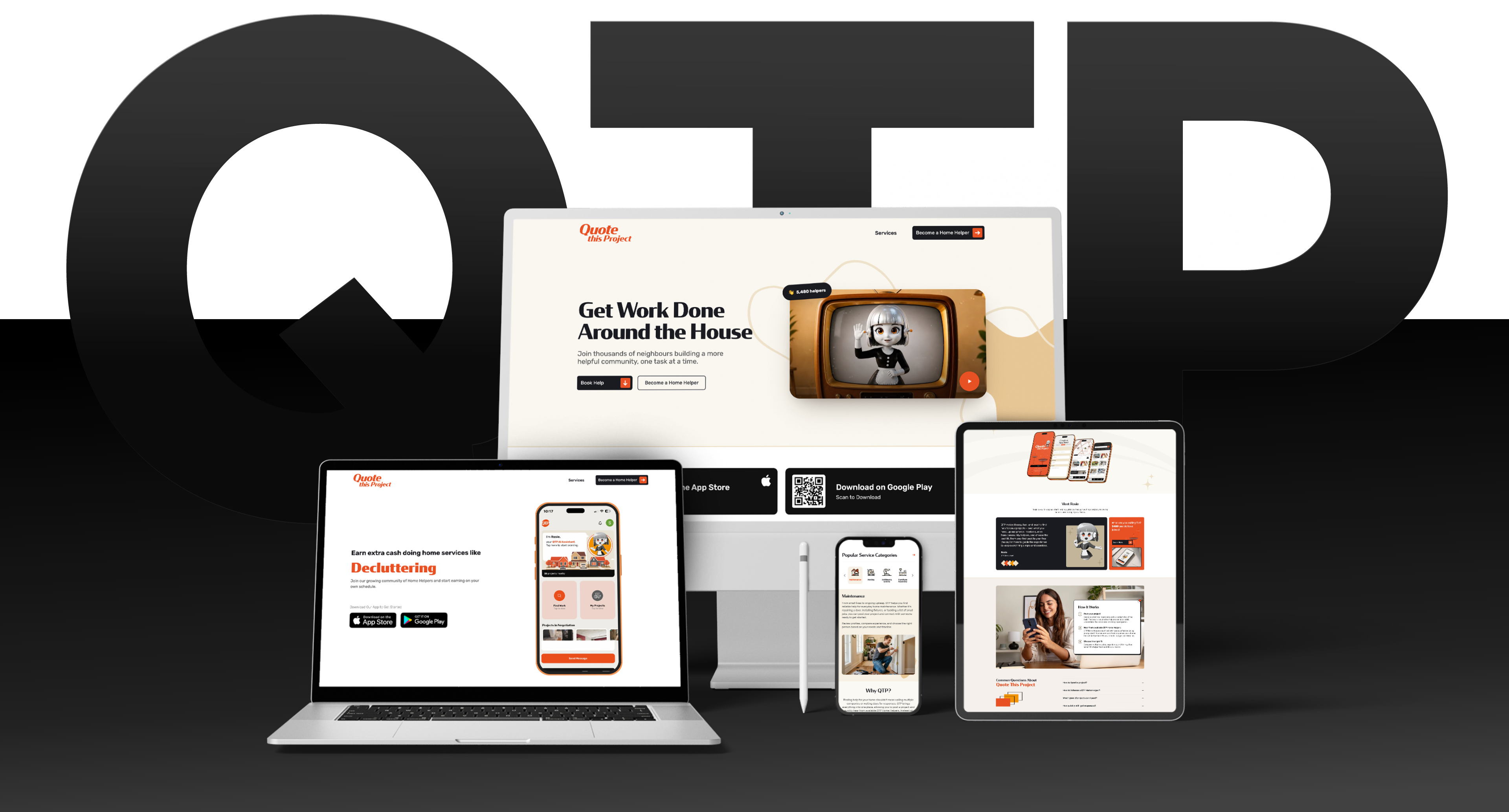
EspioLabs brought the QTP product into one complete digital system.
- A mobile app
- A public website
- A brand character
- Animation direction
- A launch marketing foundation
The work was about making the marketplace easy to understand from the first impression of using the app. Homeowners had to learn how to post a task and compare quotes. Helpers needed to know how to identify opportunities for projects and how to respond confidently. The brand had to be friendly enough for people to use it in homes and clear enough to explain a new two-sided marketplace. EspioLabs didn't treat the app, website, Rosie character system, and marketing as separate pieces but built them around one shared product story: QTP helps homeowners get everyday tasks done with help from local people.

From Product Concept to a Local Marketplace
QTPAPP.COM
QTPAPP.COM was developed as the Quote This Project public-facing website. The website had to clearly explain the app, support launch awareness, and speak to homeowners and helpers, without making the platform feel divided or confusing.
The site describes how QTP helps homeowners with common tasks at home. For helpers, it offers a flexible way to find local job opportunities, submit quotes, and make money when they want.
The website helps to build platform credibility by explaining QTP, how it works, who it is for, and what users can expect before they download or sign up.
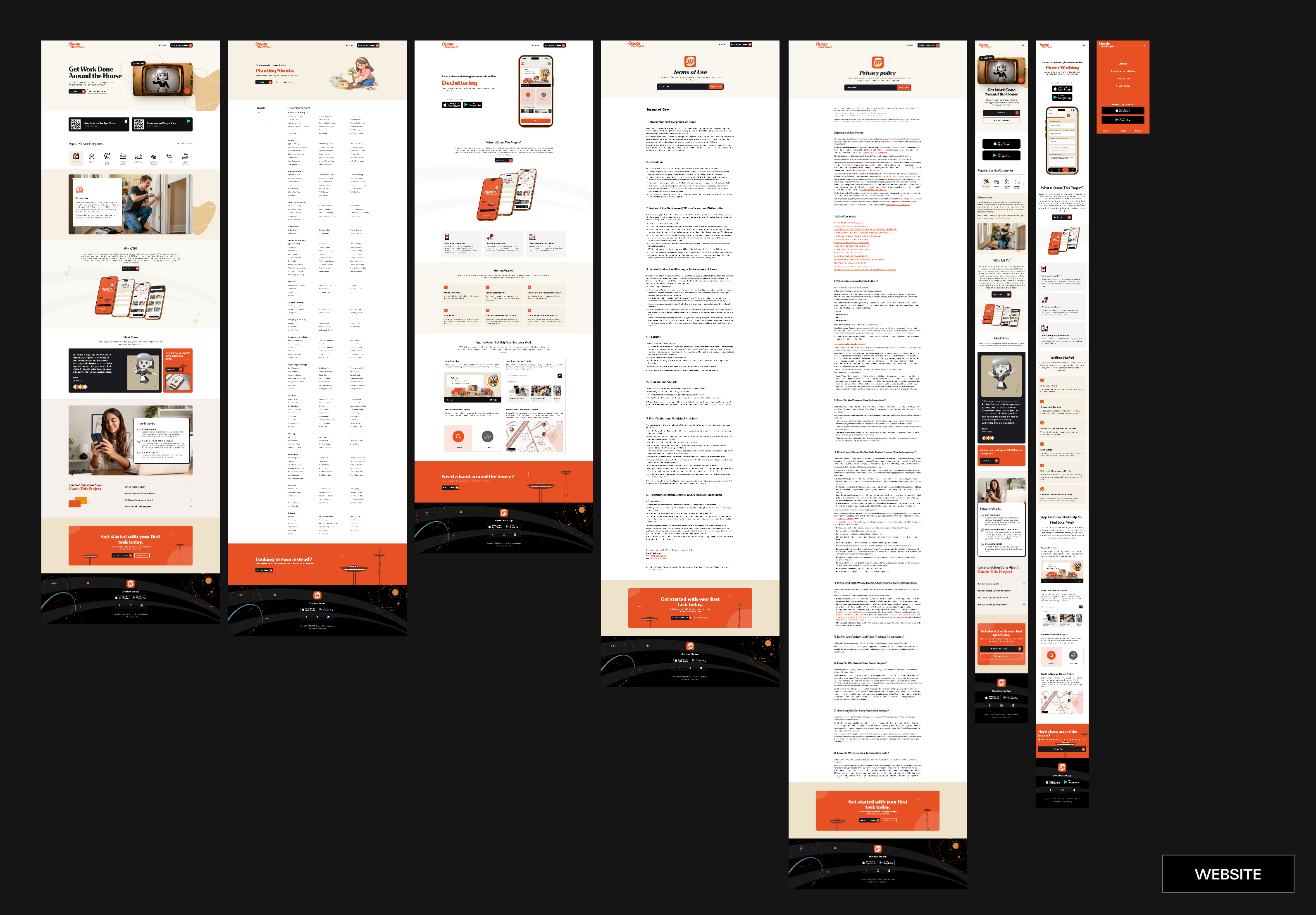
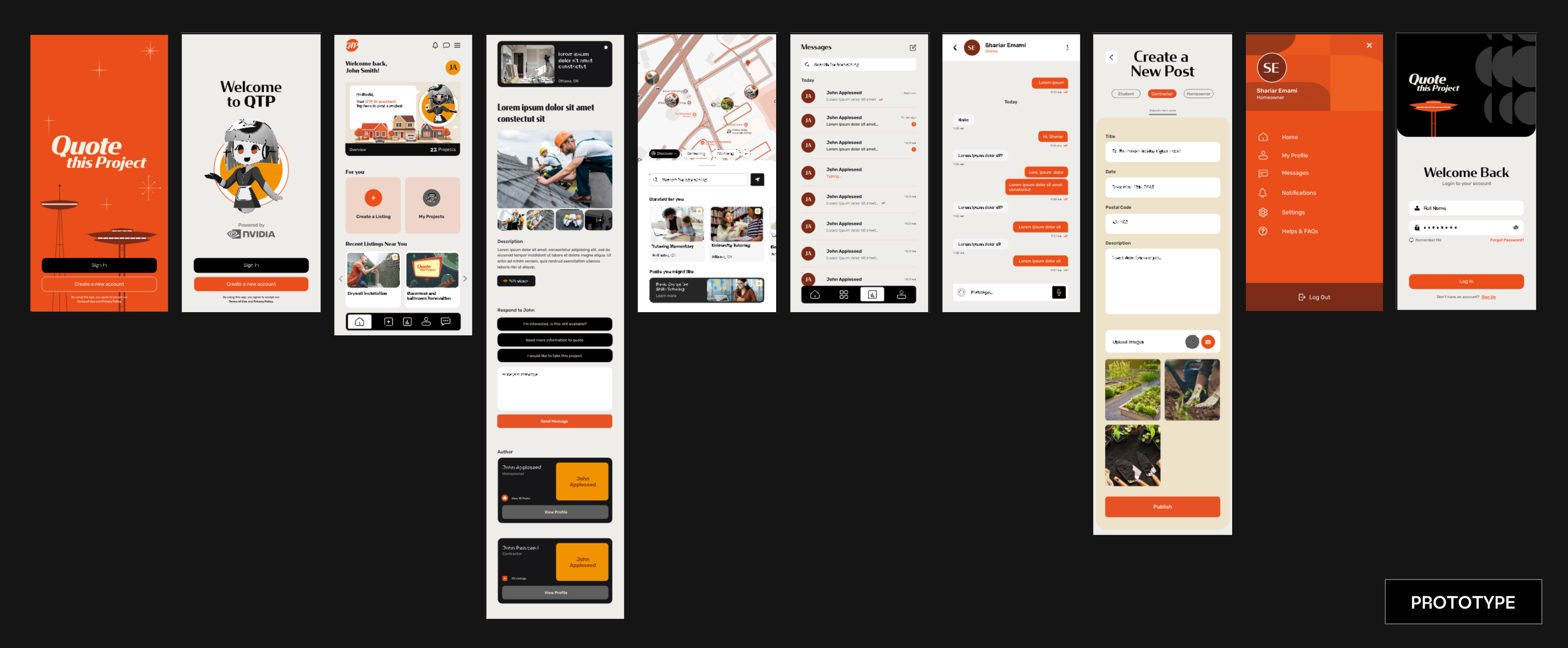
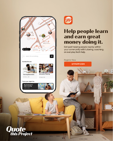
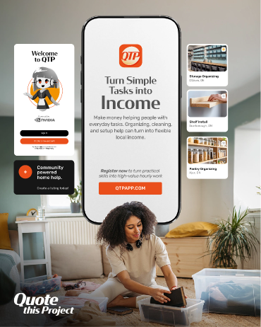
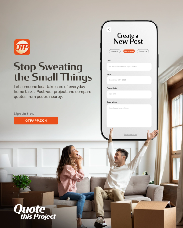
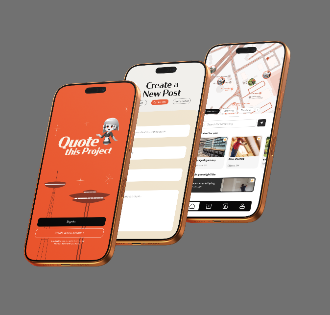
App Design + Development
Quote This Project is a local marketplace app where homeowners can post everyday home tasks and get quotes from nearby helpers. The experience was designed to make things easier for both sides of the platform.
Homeowners can describe what they need, compare responses, and choose the helper that fits their budget, schedule, and task. QTP Home Helpers can search for opportunities and bid on projects that fit their schedule and comfort level.
From the first screen, the product had to feel simple. Helpers needed an easy way to get work without a complicated onboarding process. Homeowners needed to know how to post a task without reading a long explanation. The interface uses clear categories, straightforward calls to action, and a friendly visual system that makes the platform feel approachable rather than transactional.
- Homeowner project posting flow
- Helper project discovery and quoting experience
- Task category structure for everyday home needs
- Project management screens for active and past tasks
- Rosie AI assistant integration within the app experience
- Mobile-first interface design built for fast, simple usage
Download the App to Get Started


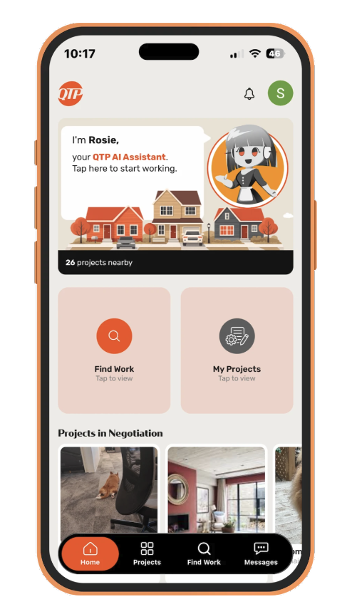
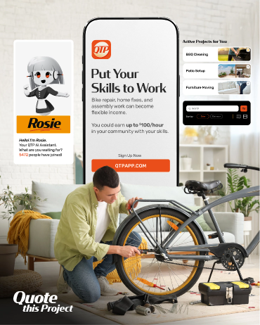
Introducing Rosie, QTP's AI Assistant
Rosie is QTP's friendly AI assistant and character mascot. She brings a more memorable personality to the app and helps the product seem less like a bare-bones marketplace interface.
The character direction was helpful, playful and accessible. Rosie adds to the app experience by guiding users through, adding a visual warmth, and giving the brand a character that can be recognized and can appear throughout the app, on the website, in launch assets and in social content.
The process began with rough sketches, then refined character artwork, and then adapted Rosie into multiple poses and expressions for use across the digital product and marketing system.
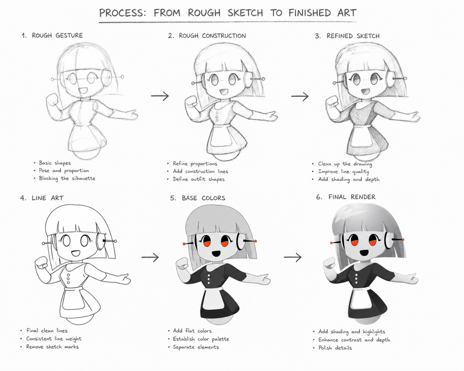
Animation + Lottie
To make Rosie feel more active inside the product, EspioLabs built animation-ready character assets and Lottie-style motion concepts. The animations assist with onboarding, in-app prompts, loading moments, and branded interactions without overwhelming the user.
The direction of the animation was light and functional. Each state of motion had to support the experience without interfering with the task. Rosie's expressions, poses, and gestures were crafted to make the app more guided, friendly, and human.
- Character pose development
- Expression and gesture variations
- Animation-ready visual assets
- Lottie-style motion planning
- In-app assistant moments and branded interaction concepts


Results
EspioLabs helped QTP transition from a product concept to a launch-ready digital platform with the core pieces needed to introduce, explain and promote a two-sided home task marketplace.
In the final product, QTP got more than an app interface. It created a complete brand and product system including mobile app design, website design, character design, animation-ready assets and launch marketing. Each piece was in sync to make the platform feel practical, welcoming and easy to understand for homeowners and local helpers.
QTP left the project with a clearer way to communicate what the app does, who it serves, and how users can get started.
- A two-sided marketplace app designed and developed for homeowners and QTP Home Helpers
- A public website built to explain the platform, support launch awareness, and guide users toward registration
- A clearer product story around everyday home tasks, local helpers, and flexible project work
- Rosie, a recognizable AI assistant and character mascot for the app, website, and marketing system
- Animation-ready character assets for in-app prompts, branded interactions, and promotional content
- A launch marketing foundation with social content, platform messaging, campaign ideas, and audience-specific copy
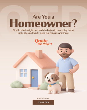
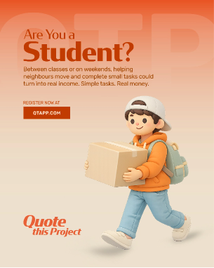
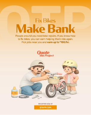
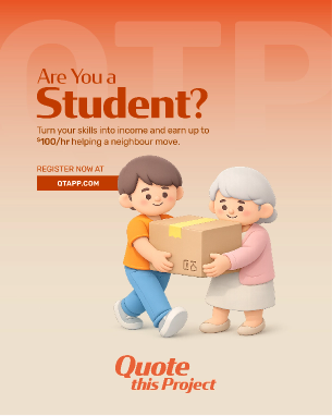
Marketing
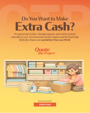
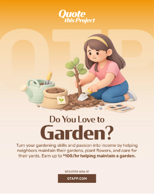
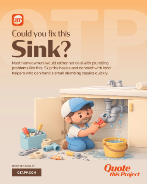
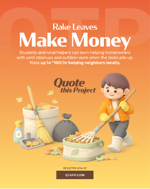
QTP's marketing comms needed to quickly clarify what the platform was, and make the app feel useful to both homeowners and helpers. Content should represent real world task scenarios such as yard work, home improvement, moving, furniture assembly, cleaning and seasonal household assistance.
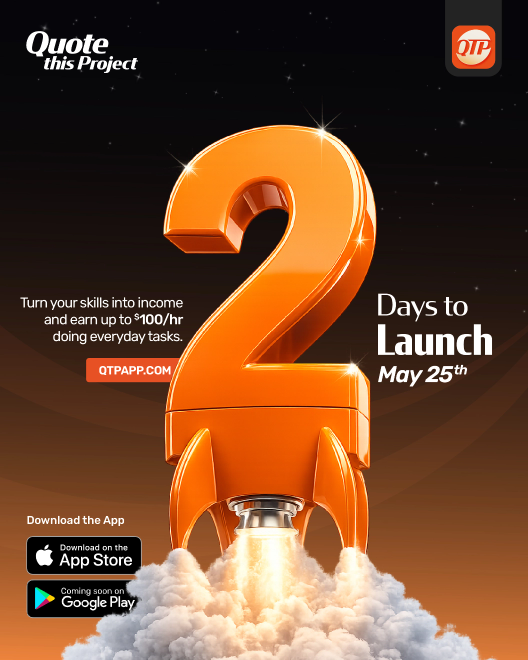
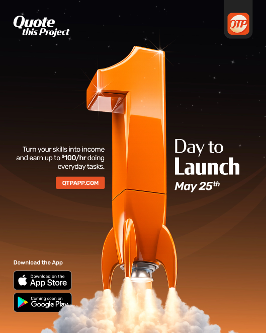
QTP received social media posts, launch messaging, promotional graphics, campaign ideas and audience-specific copywriting from EspioLabs. The creative direction used simple task-based hooks, friendly visuals and clear calls to action so users could understand the app without a long explanation.
The marketing was to drive awareness and registration and to help both sides of the marketplace understand where they fit in.
- Social media post concepts and captions
- Launch campaign messaging
- Homeowner-focused promotional content
- Helper-focused promotional content
- App store and website positioning support
- Visual content built around common home task scenarios

Visual Summary
- Outcome
- Details
- App Design & Development
- Designed and developed the QTP mobile app experience for homeowners and local helpers.
- Website
- Built QTPAPP.COM to explain the platform, support launch awareness, and guide users toward registration.
- Rosie AI Assistant
- Created Rosie as QTP's friendly assistant and character mascot for the app, website, and marketing.
- Animation & Lottie
- Developed character poses, expressions, and animation-ready assets for branded in-app interactions.
- Marketing Support
- Supported social media, launch messaging, promotional visuals, app positioning, and audience-specific content.
EspioLabs helped launch QTP — the community-powered platform connecting homeowners with trusted local helpers for everyday tasks.
The platform was designed to simplify how communities connect, enabling homeowners to post tasks, receive quotes, manage projects, and access trusted local assistance through a seamless mobile-first experience.
Let's Talk