

Website Design and Branding
for Capital Pyrotechnics
How EspioLabs Built an Event-Ready Digital Brand and Website for a Canadian Pyrotechnics Company

Client Snapshot
Engagement Scope
- Built an event-ready brand direction for Capital Pyrotechnics
- Designed and developed CapitalPyrotechnics.com
- Created a visual identity system built around celebration, scale, safety, and professionalism
- Developed website copy and service messaging for event organizers, municipalities, businesses, festivals, and private clients
- Structured the website to explain fireworks, pyrotechnics, special effects, and event production support more clearly
- Created a brand guide with colour, typography, and visual usage direction for a stronger digital presence
- Supported the brand with a polished online experience that reflects large-scale event capability
Challenge
Capital Pyrotechnics wanted a digital presence that could echo the energy and spectacle of their work but still communicate professionalism, safety, and trust. Fireworks and special effects are highly visual services, but customers are buying more than just a dramatic finish. They're looking for planning support, technical coordination, and reliability, and they want confidence that the event will be handled safely and correctly.
The challenge was to get the Capital Pyrotechnics brand and website aligned. The design had to be exciting, bold, and memorable but not chaotic. It had to evoke fireworks, celebration, and live events while still feeling refined enough for municipalities, corporate clients, festivals, event organizers, and private clients across Canada.
EspioLabs had to weigh visual impact against credibility. The final direction needed to make Capital Pyrotechnics feel premium, professional, and event-ready while giving visitors a clearer path to understanding the company's fireworks, pyrotechnics, and special effects services.
Designing a Brand Around Spectacle, Safety, and Trust
The identity for Capital Pyrotechnics had to evoke the feeling of live events at their best: bright, memorable, and energetic. Meanwhile, the spectacle on its own could not be expected to carry the brand. The website and visual system had to convey that the company is organized, experienced, and capable of supporting events where timing, coordination, and trust matter.
The design direction was built around three core ideas: spectacle, safety, and trust. The gold palette is all about warmth, celebration, and visual energy, while the darker neutrals create contrast and a more premium event-production feel. Bold typography and clean layouts help balance the excitement of the visuals with the confidence clients expect from a professional provider of fireworks, pyrotechnics, and special effects.
The result is a brand experience that feels both dramatic and in control. It provides Capital Pyrotechnics with a better visual identity for marketing events, having client conversations, and maintaining a more professional web presence.
Colours
The colour palette for Capital Pyrotechnics combines warmth, sophistication, and strength to create a bold visual identity. Stardust (#DFAF34), a rich golden yellow, represents energy, celebration, and the brilliance of fireworks, serving as the primary accent colour. Starlight (#E2C987) adds balance with a softer, elegant gold tone that brings warmth and refinement to the design. Complementing these vibrant shades are the darker neutrals Ash (#5E5B4F) and Smoke (#333333), which provide depth, contrast, and a modern industrial feel. Together, the palette captures the excitement of pyrotechnics while maintaining a professional and premium appearance.
AvantGardePrimary Font
The Avant Garde font is a geometric sans-serif typeface known for its clean lines, bold shapes, and modern aesthetic. Originally inspired by the logo design of Avant Garde magazine in the 1960s, the font became popular for its futuristic and artistic appearance. Its perfectly circular letters, sharp angles, and minimalist style make it a favorite in fashion, branding, advertising, and editorial design, where a sleek and sophisticated look is desired. Designed by Herb Lubalin and Tom Carnase, the typeface reflects the experimental and creative spirit of its era. Avant Garde is also recognized for its unique ligatures and stylized letter combinations, which give it a distinctive and elegant character. Even today, it remains widely used in logos, posters, and digital media because of its timeless, stylish, and highly recognizable design.
Open SansSecondary Font
Open Sans is a clean and modern sans-serif typeface known for its excellent readability and simple design. Created by Steve Matteson, it is widely used in websites, apps, and digital media because of its friendly and professional appearance. Its balanced letterforms make it versatile, clear, and easy to read on screens and in print.
Solution
What We Delivered:
- Built a polished brand direction for Capital Pyrotechnics
- Designed and developed CapitalPyrotechnics.com
- Created a strong visual system around fireworks, celebration, events, safety, and production confidence
- Developed website messaging that explains the company's services clearly to event planners, municipalities, businesses, festivals, and private clients
- Structured the website around service clarity, visual impact, and stronger inquiry paths
- Applied a premium colour and typography system across the digital experience
- Created a website experience that feels exciting, professional, and ready for large-scale events
The project ended in a more modern online presence that clearly articulates what the company does, who they do it for, and why clients can trust them to deliver high-impact moments in their events.

From Precision to Performance, Lights Up Ottawa
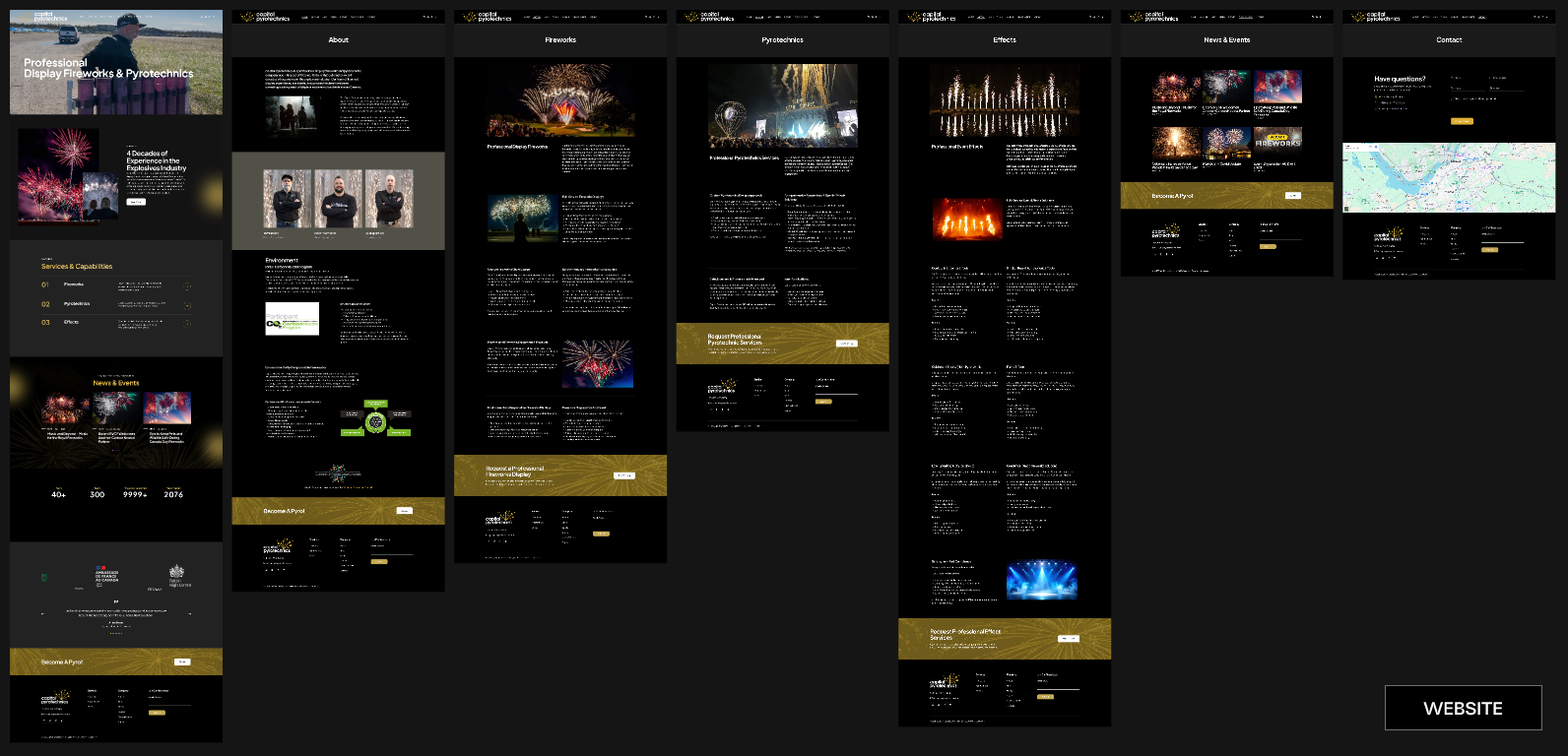
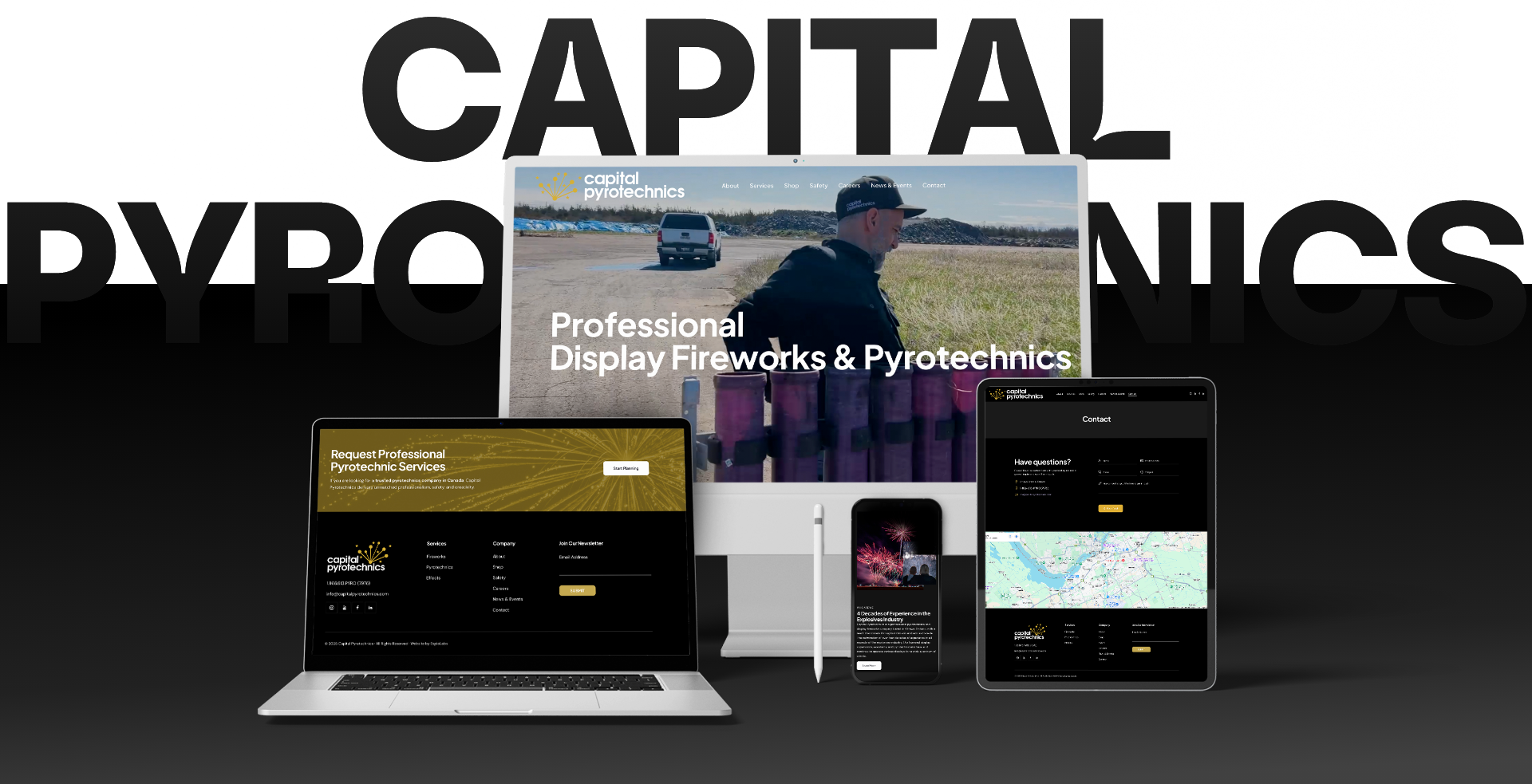
The Website
CapitalPyrotechnics.com was designed and developed to help provide the company with a stronger public face for its fireworks, pyrotechnics, and special effects services. The site had to visually hit visitors straight away but also needed to guide them to useful service information and clear contact options.
The website was designed to cater to a variety of event clients ranging from festivals and municipalities to corporate events, private parties, and organizations requiring professional pyrotechnic support. It gives Capital Pyrotechnics a more professional way to show its services, demonstrate the breadth of its work, and help future clients understand how to open a conversation.
The new site mixes striking visuals with a simple structure. This creates an exciting feel for the brand while keeping the user experience clear, direct, and easy to follow.

Results
EspioLabs helped Capital Pyrotechnics build a more polished brand and website that is ready for events and better reflects the quality and excitement of their work. This led to a more robust digital identity, improved service messaging, and a more professional platform to support event inquiries.
The new brand creates a stronger connection between visual excitement and customer trust. Capital Pyrotechnics is now better positioned to confidently offer its fireworks, pyrotechnics, and special effects services to event planners, municipalities, organizations, businesses, festivals, and private clients across Canada.
- A stronger event-ready brand identity for Capital Pyrotechnics
- A full website designed and developed around fireworks, pyrotechnics, and special effects services
- A polished colour and typography system built for visual impact and trust
- Clearer messaging for event organizers, businesses, municipalities, festivals, and private clients
- A digital presence that better reflects the scale, energy, and professionalism of the company's work
- A stronger foundation for future marketing, client conversations, and event inquiries
Visual Summary
- Outcome
- Details
- Platform
- CapitalPyrotechnics.com was designed and developed as the company's public-facing website.
- Brand Assets
- Created a colour palette, typography direction, imagery style, and an event-ready brand system.
- Service Messaging
- Developed clearer website copy for fireworks, pyrotechnics, special effects, and event production support.
- User Experience
- Built a dramatic but simple website experience that helps visitors understand services and reach out.
- Growth Foundation
- Created a stronger digital presence that supports event inquiries, client trust, and future marketing.

Every memorable experience starts with a strong first impression.
EspioLabs helps businesses transform outdated brands and websites into modern experiences that attract customers and support long-term growth. If your digital presence no longer reflects the quality of your work, let's change that.
Let's Talk