
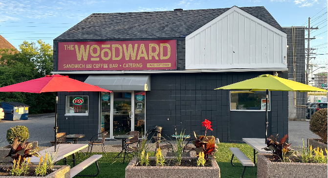
The Woodward's Bold Rebrand
From Franchise to Favourite
Client Snapshot
Engagement Scope
- Website Design & Build (WordPress)
- Brand Identity + Logo Design
- Menu Strategy & UX (Takeout + Catering)
- Responsive Design
- Ongoing Content & Menu Updates
Challenge
The Woodward was preparing to step away from a local franchise and operate as an independent brand, while also introducing catering services. With a strong local following and a reputation for stacked sandwiches, quality coffee, pastries, and gelato, the challenge was not building trust. It was building a brand.
There was no website, no visual identity beyond the former franchise, and a firm launch date on the horizon.
With limited digital experience, the owner needed a team who could simplify the process, build a scalable brand, and make it easy to update their menu and content long-term. The new identity had to feel warm, rustic, modern, and minimal without alienating their existing customer base.
Designing for Comfort,
Appetite, and Local
Loyalty
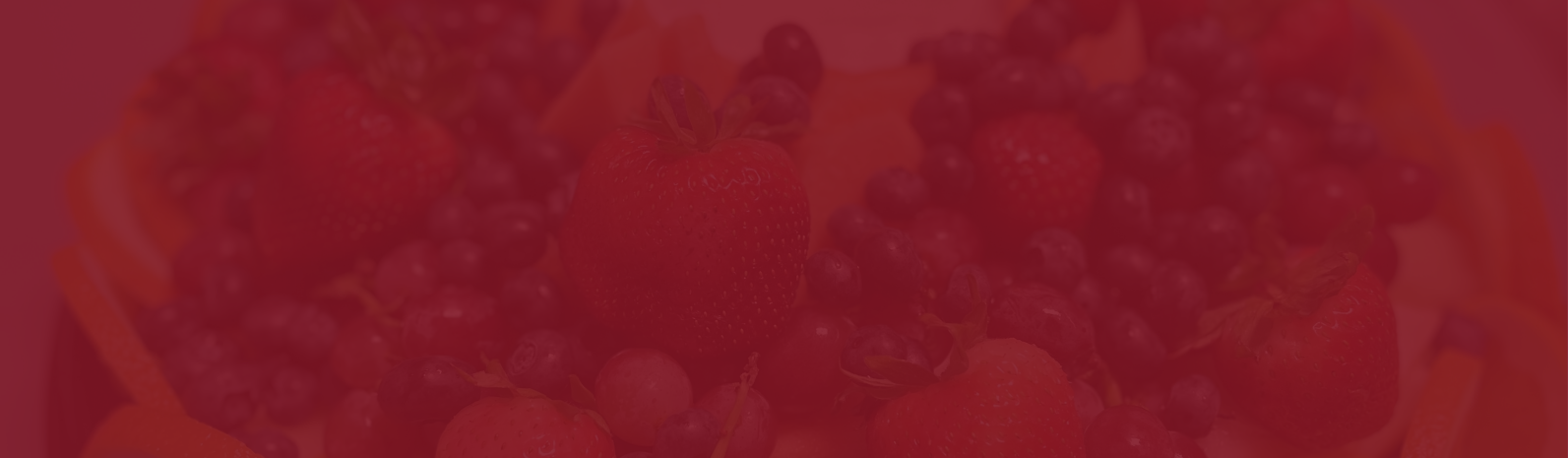
The Woodward's colour palette of Bordeaux, Deep Bordeaux, Dark Bordeaux, Gold, and Deep Gold evokes warmth, richness, and indulgence. These qualities align beautifully with their offerings of sandwiches, wraps, and coffee. The deep red tones suggest bold flavours and artisanal care, while gold accents elevate the visual identity to feel both cozy and upscale.
Altogether, this palette helps The Woodward stand out with a sense of comfort and sophistication, appealing to customers who value both taste and atmosphere.
Colours
The Woodward's colour palette of Bordeaux, Deep Bordeaux, Dark Bordeaux, Gold, and Deep Gold evokes warmth, richness, and indulgence. These qualities align beautifully with their offerings of sandwiches, wraps, and coffee. The deep red tones suggest bold flavors and artisanal care, subtly hinting at the savory, crafted nature of the food. Gold accents introduce a sense of premium quality and hospitality, elevating the visual identity to feel both cozy and upscale. Altogether, this palette helps The Woodward stand out with a sense of comfort and sophistication, fostering trust and appetite while appealing to customers who value both taste and atmosphere.
GeorgiaPrimary Font
Georgia is a widely recognized serif typeface known for its elegance, readability, and timeless appearance. Designed by Matthew Carter for Microsoft in 1993, the font was created specifically for on-screen readability while maintaining a classic, professional style. Its larger letterforms, clear spacing, and strong contrast make it highly legible across both digital and print formats. Georgia is commonly used in websites, reports, branding materials, and editorial content because it conveys sophistication, reliability, and tradition while remaining modern and approachable.
RobotoSecondary Font
Roboto is a modern sans-serif typeface developed by Google for the Android operating system. Known for its clean, geometric structure and highly readable appearance, Roboto combines a professional feel with a friendly, approachable style. Its balanced letterforms and open curves make it effective across digital interfaces, websites, mobile interfaces, and print materials. The font was designed to provide clarity and consistency at various screen sizes, making it one of the most widely used typefaces in contemporary UI and brand design.
Solution
EspioLabs led a full brand and digital rollout designed to position The Woodward as a standout in Ottawa's takeout café scene.
What We Delivered:
- Logo design and brand system built around deep Bordeaux and gold tones to evoke warmth and craftsmanship
- WordPress site optimized for speed and mobile usability
- Custom menu layout divided into Takeout and Catering menus, built for easy browsing on all devices
- Brand guidelines including colour palette, typefaces, and logo usage
- Ongoing updates and edits handled by EspioLabs as needed
Sandwiches, coffee, treats, and catering proudly serving the Carlington area since 2020.

Results
The full rebrand and website for The Woodward were successfully launched in under two months, resulting in increased online visibility and stronger local traffic. Customers responded positively to the improved navigation and refreshed visual identity, while the business also experienced a rise in catering inquiries within the first quarter after launch. The new platform empowered the client to independently manage and update menu content with ongoing support from EspioLabs as needed.

Visual Summary
- Outcome
- Details
- Platform
- WordPress
- Launch Time
- < 2 months
- Menu UX
- Split catering/takeout sections, mobile-optimized
- Brand System
- Logo, colour palette, usage guide
- Ongoing Maintenance
- Updates by client with support from EspioLabs
From franchise to favourite.
EspioLabs helps hospitality and food businesses design identities and digital homes that drive results. Need to go independent without losing your base?
Let's Talk