Modern Power
How EspioLabs Recharged Renfrew Hydro's Brand and Website
Client Snapshot
Client: Renfrew Hydro
Industry: Electricity Distribution
Company Size: 10 employees, serving 4,350+ residences and businesses in Ontario
Industry: Electricity Distribution
Company Size: 10 employees, serving 4,350+ residences and businesses in Ontario
Engagement Scope
- –Website Redesign & Development (WordPress)
- –Custom Multi0-Step Forms + Hotspot Invoices
- –Logo Design + Brand Identity Package
- –Responsive Design System
- –Hosting & Ongoing Support
- –Client Training + Admin Access

Challenge
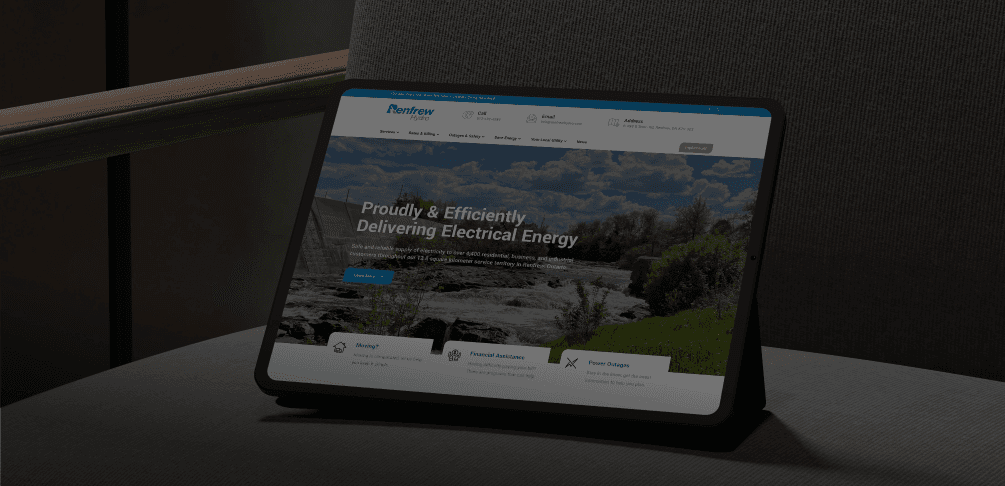
Renfrew Hydro had an outdated web presence and a legacy logo that no longer reflected its role as a modern, community-focused utility. Their crest-style branding needed to evolve, and their website lacked clarity, accessibility, and essential tools to serve their growing customer base.
The company was prioritizing a shift to paperless billing and self-service. Their website needed to support that initiative with intuitive navigation, multi-step forms, hotspot invoice tutorials, an alert bar for outages, and detailed service information optimized for all screen sizes.
As an existing client within our broader network, Renfrew Hydro was introduced to EspioLabs to modernize their brand and digital experience.
Before
After


Designing for Sustainability, Clarity, and Trust
Our goal in redesigning Renfrew Hydro's brand was to reflect both its heritage and future direction. As a trusted local utility, the identity needed to honour its legacy while presenting a confident, sustainable, and customer-first image.
We focused the design system around three core principles: sustainability, clarity, and trust. These guided every creative choice, from the simplified logo to the accessible layout and clean typography. The system had to feel modern and efficient, while still familiar to long–time customers.
The colour palette became a key element in communicating these values, serving as the emotional connector between Renfrew Hydro's mission and the user experience across every touchpoint.
Colours
This colour palette beautifully reinforces Renfrew Hydro's deep-rooted legacy and its commitment to sustainability and innovation. Ocean and Sky represent the natural elements of water and air, which are core to hydroelectric power, evoking clarity, reliability, and flow. Leaf and Tea shades emphasize the brand’s eco-conscious mission, signaling growth, renewal, and harmony with nature. Midnight, a grounded, deep tone, anchors the palette with a sense of heritage, trust, and stability, ideal for a company with a longstanding history.
Altogether, this palette connects the brand emotionally with its users, balancing nature, trust, and innovation in a visually calm, confident identity.
Midnight
#0D222B
Tea
#BFDBA5
Sky
#5E9AC6
Leaf
#63B345
Ocean
#1A5E97
Ocean
#1A5E97
Leaf
#63B345
Sky
#5E9AC6
Tea
#BFDBA5
Midnight
#0D222B
Solution
EspioLabs delivered a comprehensive rebrand and rebuilt Renfrew Hydro's website from the ground up on WordPress.
What We Delivered:
- –Modernized logo system and full brand guide (typography, colour palette, usage rules)
- –Custom-designed, responsive WordPress site with intuitive structure and mobile-first design
- –Multi-step customer service forms, outage alerts, and interactive invoice explanations
- –Visual system designed for accessibility and legibility across devices
- –Training for Renfrew Hydro staff to manage updates and alerts in-house


Result
- –Strengthened brand recognition in residential and commercial markets
- –Increased digital engagement and inbound customer inquiries
- –Improved user experience and credibility with modern, consistent design
- –Positioned Renfrew Hydro as a sustainable energy leader
- –Brand rollout supported internal and external communications across channels
Visual Summary
| Outcome | Details |
|---|---|
| Platform | WordPress |
| Brand Assets | Logo, typography, colour palette, usage guide |
| Custom Features | Multi-step forms, invoice tooltips, outage alerts |
| User Experience | Mobile-optimized, accessible design |
| Ongoing Support | Hosting + content updates by EspioLabs |

Utility brands don't have to feel outdated. Renfrew Hydro's transformation shows how design, clarity, and accessibility can help customers feel more informed, empowered, and connected.
EspioLabs partners with organizations like Renfrew Hydro to turn legacy systems into modern digital experiences. Need to upgrade your brand or website without disrupting your customers?