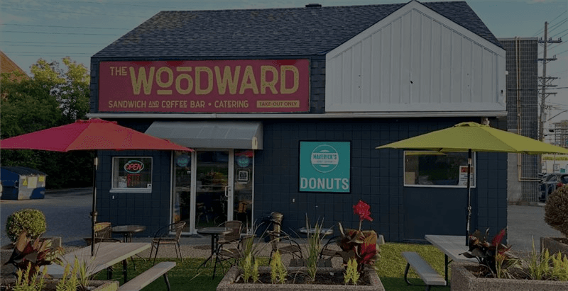
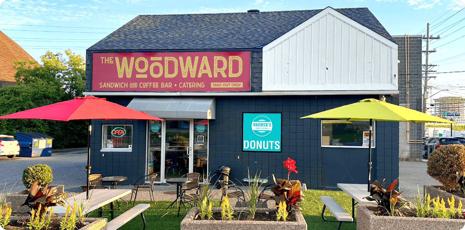
The Woodward’s Bold Rebrand
From Franchise to Favourite
Client Snapshot
Client: The Woodward
Industry: Food & Beverage (Takeout Café + Catering)
Company Size: Single Location – Ottawa, Canada
Industry: Food & Beverage (Takeout Café + Catering)
Company Size: Single Location – Ottawa, Canada
Engagement Scope
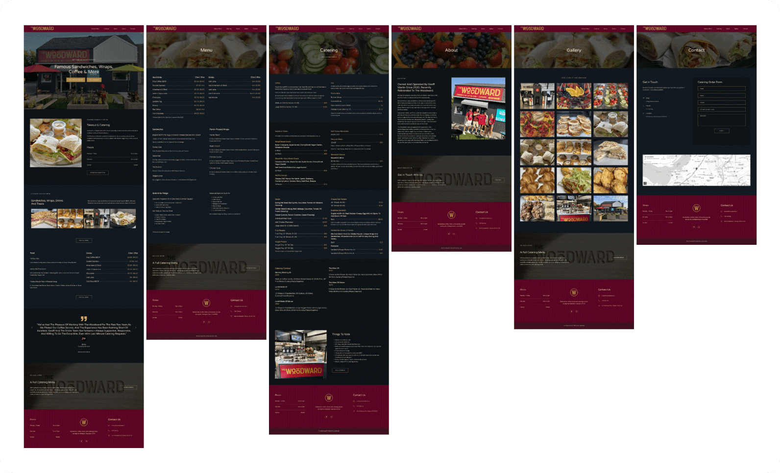
- –Website Redesign & Development (WordPress)
- –Custom Multi–Step Forms + Hotspot Invoices
- –Logo Design + Brand Identity Package
- –Responsive Design System
- –Hosting & Ongoing Support
- –Client Training + Admin Access
Challenge
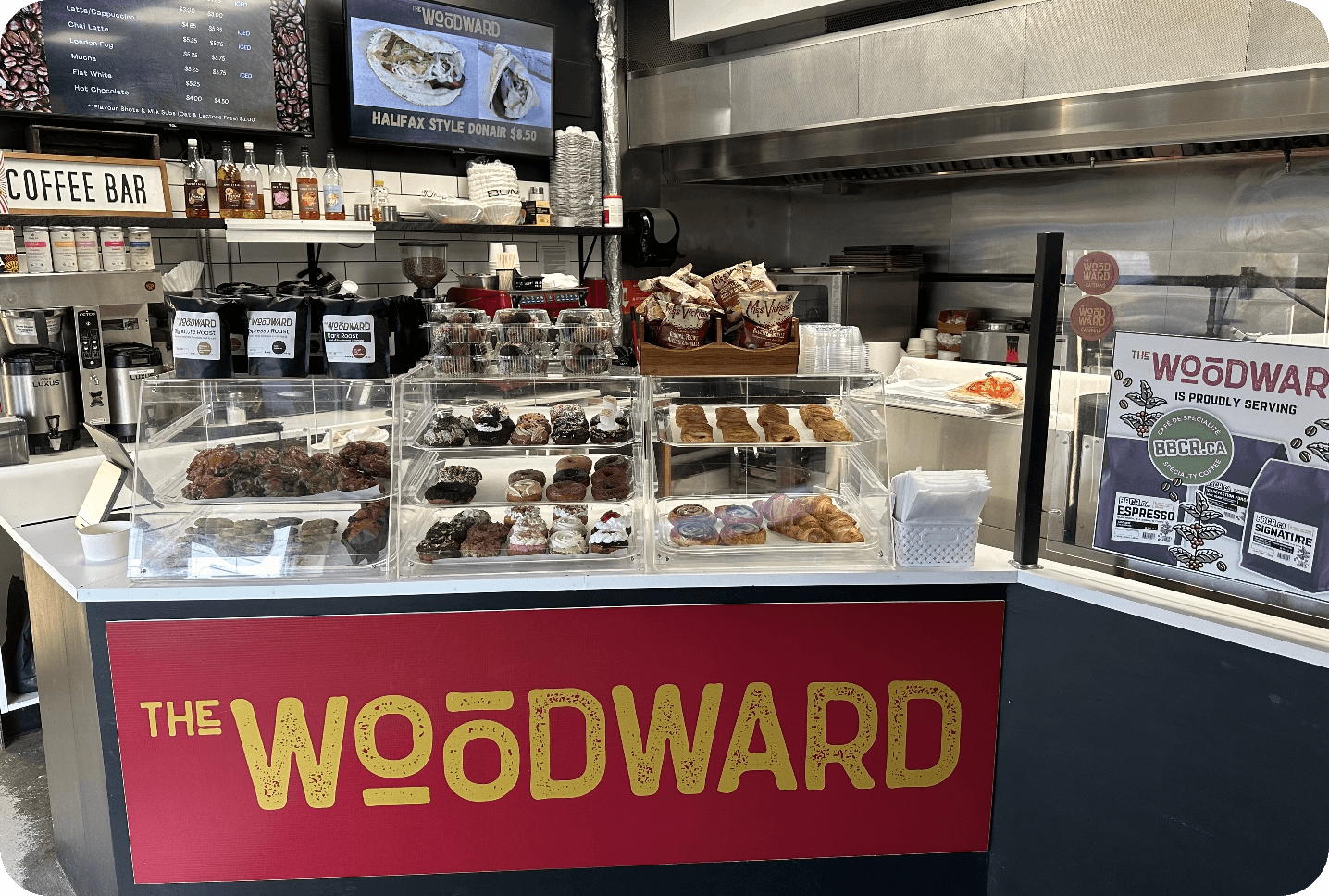
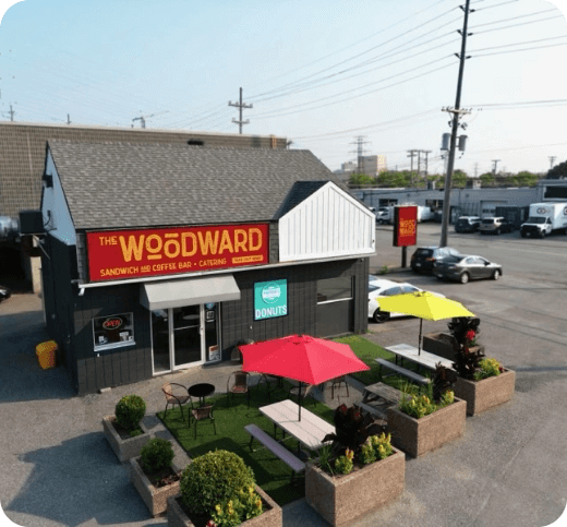
The Woodward was preparing to step away from a local franchise and operate as an independent brand, while also introducing catering services. With a strong local following and a reputation for stacked sandwiches, quality coffee, pastries, and gelato, the challenge was not building trust. It was building a brand.
There was no website, no visual identity beyond the former franchise, and a firm launch date on the horizon.
With limited digital experience, the owner needed a team who could simplify the process, build a scalable brand, and make it easy to update their menu and content long-term. The new identity had to feel warm, rustic, modern, and minimal without alienating their existing customer base.
Designing for Comfort, Appetite, and Local Loyalty
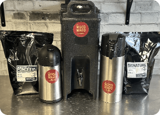
The Woodward’s colour palette of Bordeaux, Deep Bordeaux, Dark Bordeaux, Gold, and Deep Gold evokes warmth, richness, and indulgence. These qualities align beautifully with their offerings of sandwiches, wraps, and coffee. The deep red tones suggest bold flavours and artisanal care, while gold accents elevate the visual identity to feel both cozy and upscale.
Altogether, this palette helps The Woodward stand out with a sense of comfort and sophistication, appealing to customers who value both taste and atmosphere.
Colours
Woodward’s colour palette of Bordeaux, Deep Bordeaux, Dark Bordeaux, Gold, and Deep Gold evokes warmth, richness, and indulgence. These qualities align beautifully with their offerings of sandwiches, wraps, and coffee. The deep red tones suggest bold flavors and artisanal care, subtly hinting at the savory, crafted nature of the food. Gold accents introduce a sense of premium quality and hospitality, elevating the visual identity to feel both cozy and upscale. Altogether, this palette helps The Woodward stand out with a sense of comfort and sophistication, fostering trust and appetite while appealing to customers who value both taste and atmosphere.
Deep Gold
#AB8C4E
Gold
#C0A160
Dark
Bordeaux
Bordeaux
#3E131F
Deep Bordeaux
#3E131F
Bordeaux
#5C0623
Bordeaux
#5C0623
Deep Bordeaux
#3E131F
Dark
Bordeaux
Bordeaux
#3E131F
Gold
#C0A160
Deep Gold
#AB8C4E
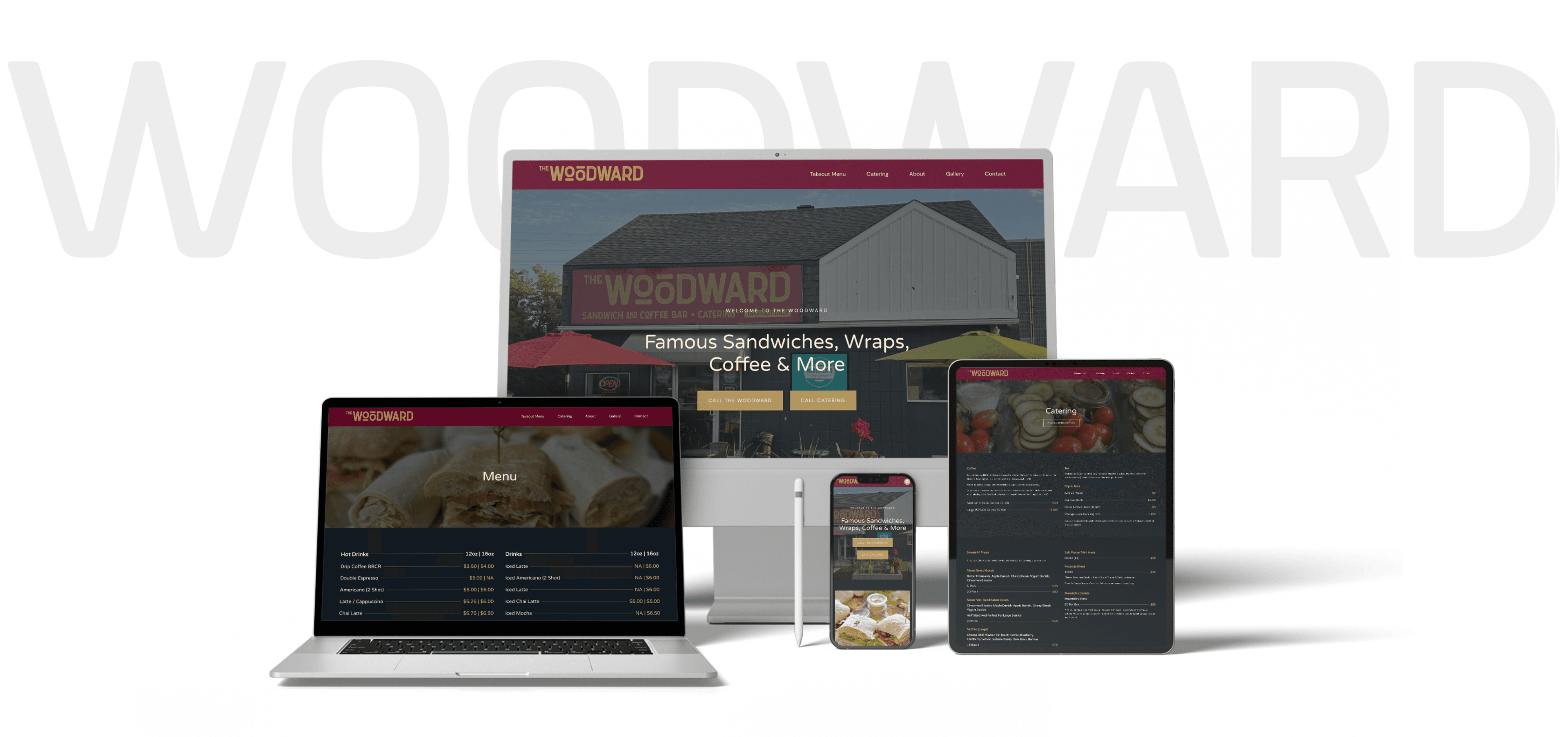
Solution
EspioLabs led a full brand and digital rollout designed to position The Woodward as a standout in Ottawa’s takeout café scene.
What We Delivered:
- –Land brand system built around deep Bordeaux and gold tones to evoke warmth and craftsmanship
- –WordPress site optimized for speed and mobile usability
- –Custom menu layout divided into Takeout and Catering menus, built for easy browsing on all devices
- –Brand guidelines including colour palette, typefaces, and logo usage
Result
- –Strengthened brand recognition in residential and commercial markets
- –Increased digital engagement and inbound customer inquiries
- –Improved user experience and credibility with modern, consistent design
- –Positioned Renfrew Hydro as a sustainable energy leader
- –Brand rollout supported internal and external communications across channels
Visual Summary
| Outcome | Details |
|---|---|
| Platform | WordPress |
| Launch Time | < 2 months |
| Menu UX | Split catering/takeout sections, mobile-optimized |
| Brand System | Logo, colour palette, usage guide |
| Ongoing Maintenance | Updates by client with support from EspioLabs |

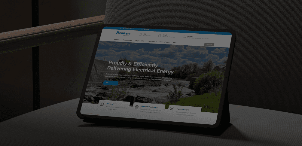
Utility brands don’t have to feel outdated. Renfrew Hydro’s transformation shows how design, clarity, and accessibility can help customers feel more informed, empowered, and connected.
EspioLabs partners with organizations like Renfrew Hydro to turn legacy systems into modern digital experiences. Need to upgrade your brand or website without disrupting your customers?